

NHL UNIFORM REDESIGNS
Dark jerseys

ANAHEIM DUCKS
This redesign takes inspiration from a few different jerseys the Ducks have worn through their history. Despite a new logo, some brighter colors, and unique striping, this redesign still has a strong Anaheim Ducks feel to it.

BOSTON BRUINS
This may be the most controversial redesign of the list. There is a lot of history in the Bruins franchise, but one thing has always bugged me: why does Boston use black when "bruin" literally means brown bear? The addition of cranberry, which is drawn from a Massachusetts state color, is sure to aggravate some, but I like the new look.

BUFFALO SABRES
Navy and yellow is a great look for Buffalo, and their alternate "B" logo should be their primary. I made my own version of that great logo but didn't change a whole lot else.
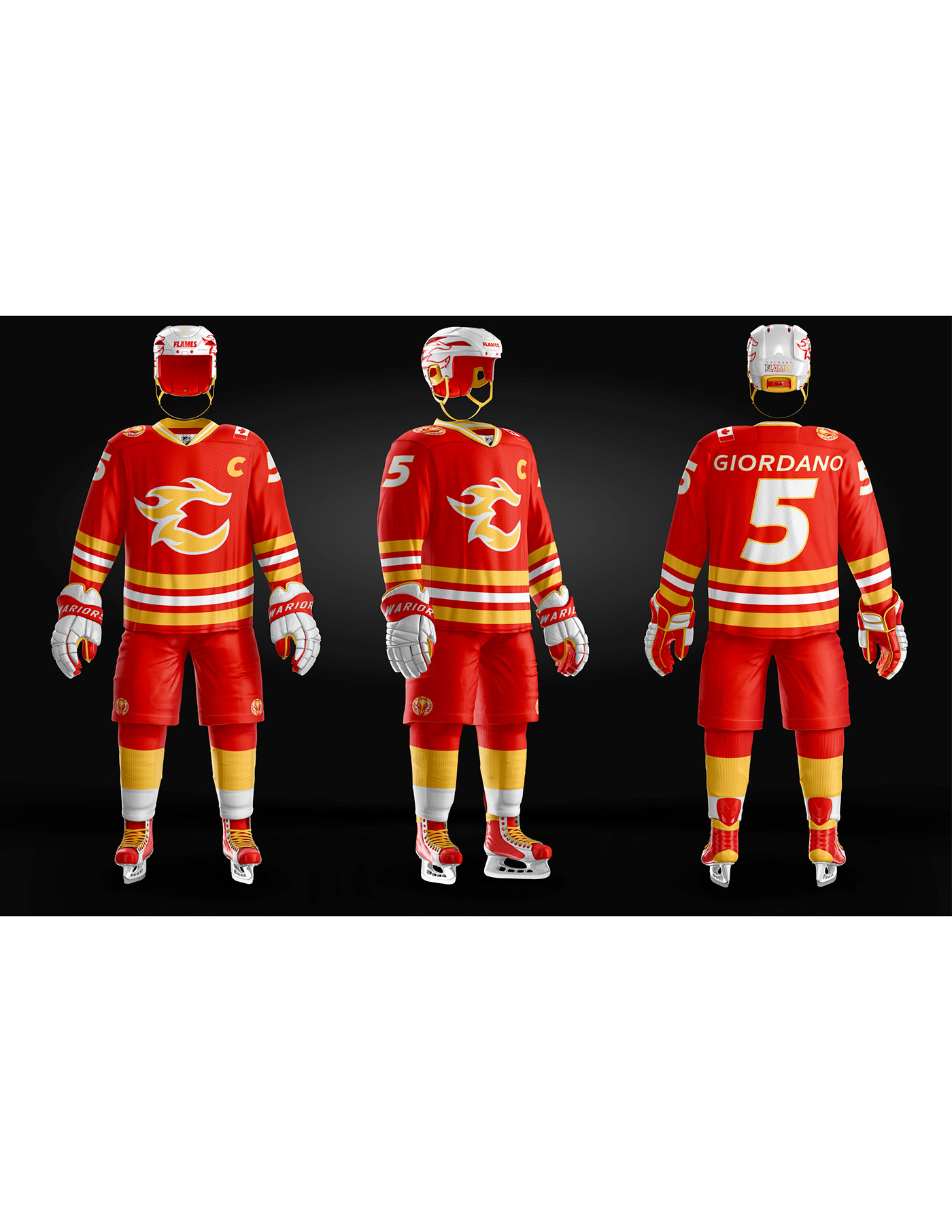
CALGARY FLAMES
This jersey design is almost exclusively drawn form the Flames 80's jersey. I never understood why that jersey was controversial since I think it is one of the best looks in the league's history.

CAROLINA HURRICANES
One of the best designs in the NHL is the hurricane warning flag found in in the Canes' branding. Not only did I keep it in my design, I emphasized it.

CHICAGO BLACHAWKS
As Blackhawks fan, this one was tough for me. They have a classic and relatively untouched look since their Original Six days. However, in the back of my mind, I negatively relate their logo with the Cleveland Indians' caricature logo. I felt that I had to make an update, so I ran with the Blackhawk military helicopter, due to Chicago being home to a military base. I also use the Chicago flag, the best city flag in the country, as a design element throughout.

COLORADO AVALANCHE
Colorado has one of the coolest designs and color schemes. Colorado also has an amazing flag design. I simply combined the best of both worlds in this redesign.
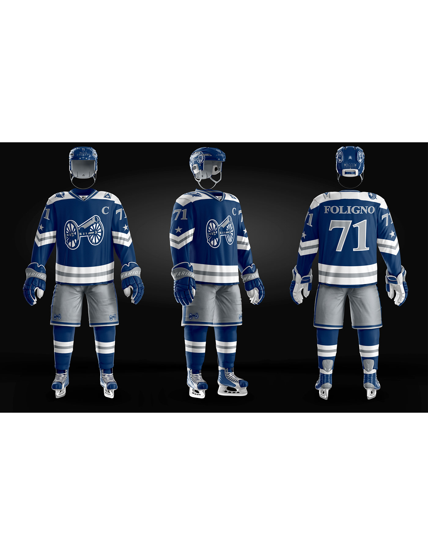
COLUMBUS BLUE JACKETS
Columbus' best logo becomes their primary. Also, I push the theme of Ohioan militia a bit further with some unique sleeve striping.

DALLAS STARS
Between having a great logo, color palette, and Texas pride, it didn't feel right to fiddle too much with Dallas' look. Aside from an updated logo, this concept is very similar to the Stars' current uniform design.

DETROIT RED WINGS
Detroit has such a classic look, but I still made some adjustments. A more modern logo, combined with striping and shoulder details emphasizing the motor industry, and the Red Wings have a fresh revamp.

EDMONTON OILERS
Some aspects of the Oilers look, such as the striping and the blue/orange color scheme, work really well. However, I've never been a fan of their logo; my new logo concept is based on a land oil rig. I also slightly adjusted the color tones found in their brand.

FLORIDA PANTHERS
In perhaps the brightest redesign of the list, I exchange the deep navy and red for a more Florida-esque red/fuchsia and gold.

LOS ANGELES KINGS
Bring back the crown! Bring back the purple and gold!The best look from their history comes back, with a nod to the jerseys worn during the King's 2010s Cup runs in the sleeve design.

MINNESOTA WILD
The greatest logo in all of sports, in my opinion. I only took out the red since it doesn't really say "forest" or "wilderness" to me. Embrace the green of nature. I know the North Stars became the Dallas Stars, but their Minnesota roots give them a connection to the Wild now.

MONTREAL CANADIENS
I didn't feel morally justified to alter such a classic look. I only slightly adjusted the logo, but kept everything very similar to their historic look.

NASHVILLE PREDATORS
There is a bit too much yellow in the Pred's current jersey design; I broke it up with some more of the dark color. Also, I may be jumping on the bandwagon, but the guitar string striping is great look for Nashville.

NEW JERSEY DEVILS
One of the cleanest looks in the NHL. I hardly changed anything except for a fresh NJ logo.

NEW YORK ISLANDERS
The Islanders have great look, but I've never liked their text-heavy current logo. In my redesign, I gave the logo an update based on their alternate, and pushed the island theme a bit further with the waves.

NEW YORK RANGERS
The Rangers have a historic and classic brand identity that was hard to mess with. However, like the Islanders, their current logo is too text-heavy for me. I drew inspiration from their Stature of Liberty alternate logo.

OTTAWA SENATORS
Probably my biggest color change of the list. The blue and green (or turquoise) are drawn from the Ottawa flag. Senator...government...flag... That was my thinking, at least. Also, I never understood the Roman senator in their logo, so I brought back the original "O".

PHOENIX COYOTES
The colors and gradient striping both contribute to the idea of the Phoenix desert. The enclosing shape in the logo is also the general shape of the state of Arizona.

PHILADEPHIA FLYERS
Philly has the best sleeve design and color combo in the league. I had to keep that in my design along with the unique, yet controversial, name-enclosing box.

PITTSBURGH PENGUINS
The Penguins go back to their best logo. The classic look remains.

SAN JOSE SHARKS
Teal and orange are an amazing color combo that I made sure were evident in my redesign. And while I do love the Sharks current logo, I figured I'd give them a simple revamp.

ST. LOUIS BLUES
The colorful redesign from my previous post becomes the alternate jersey design, and the classic blue and yellow stay.

TAMPA BAY LIGHTNING
Not much is new here. A new shade of blue and a lightning design on the sleeves are the only major changes.

TORONTO MAPLE LEAFS
Another classic look with a text-heavy logo, which I redesigned simpler and more geometrically.

VANCOUVER CANUCKS
I brought back the bright colors and rink logo (one of the best in NHL history) to liven up this Canuck uniform.

VEGAS GOLDEN KNIGHTS
Vegas has one of the best looking designs in the league right now. I removed the red since it isn't in Vegas' logo and made their alternate logo their primary one, though both are great.

WASHINGTON CAPITALS
I never understood why the Caps use a word-mark as the primary logo when hey have an awesome alternate. I designed my own version of it but generally kept the concept similar to their current look.
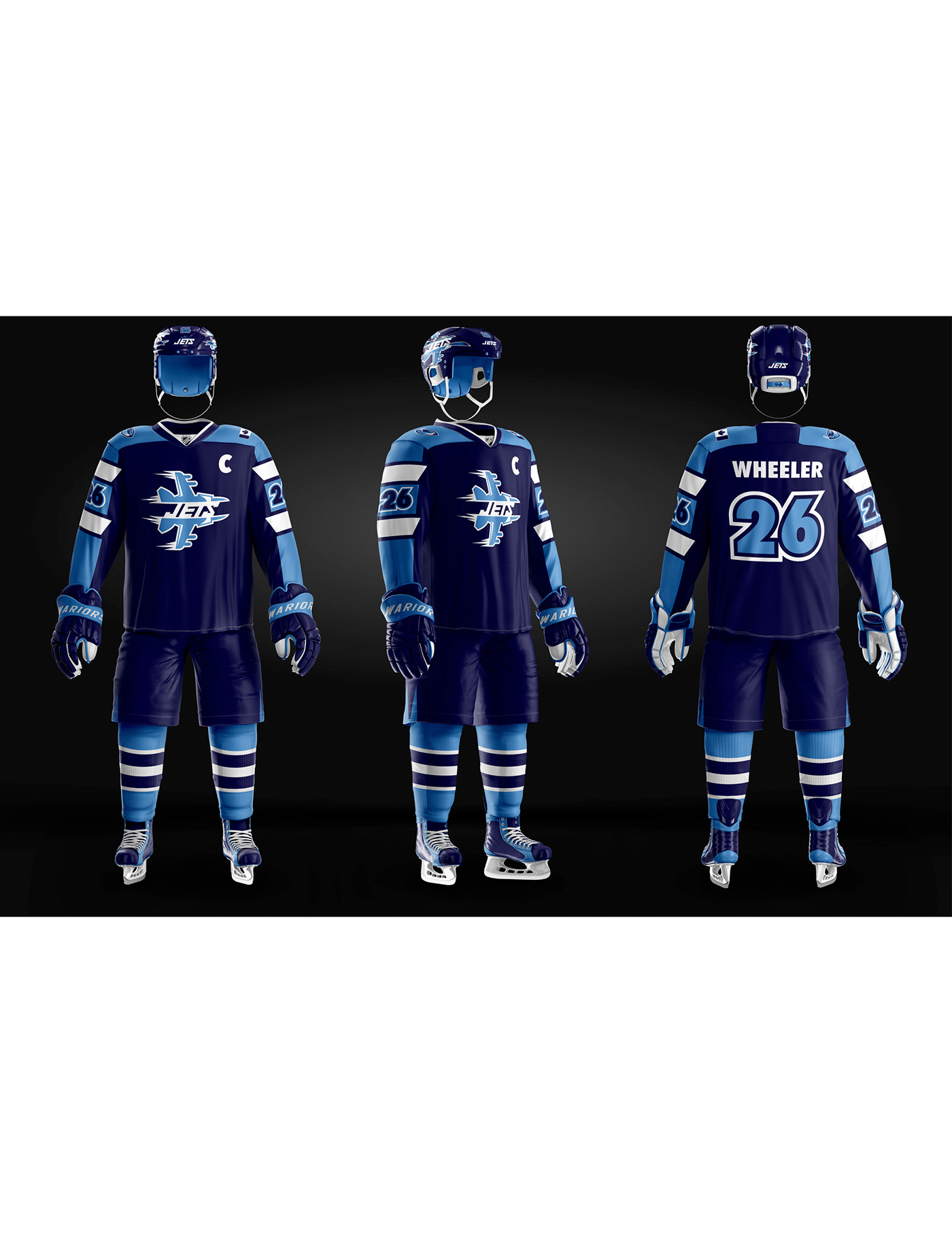
WINNIPEG JETS
This may be controversial, but I've never liked the Jets 70's-80's logo. I designed my own and simplified the color palette to only the shades of blue.


